Research, Strategy, UX UI, Content & Handoff
Wise Banking
Website Redesign
Location
London
role
Research, Strategy, UX UI, Content & Handoff
Year
2025
Services
Digital Banking

the frief
Cadisch Screenprinting serves both large institutions, such as universities and colleges and independent creatives and artists, but its outdated website serves neither well. Products are hard to find, information is scattered and there is no clear content or visual hierarchy to guide visitors. People can’t quickly tell what Cadisch offers or what to do next, which frustrates customers, adds enquiry handling for staff and weakens trust in the brand for new users.
the starting point
The four of us split the archetypes. I took Relocators ("I live in a different country to where I was born"). My first instinct was migration, people moving abroad and sending money back home to family.
Remittance scale:
An estimated $831 billion moves globally, which is more stable than capital flows and strongly beneficial for reducing poverty.
Why people migrate:
Economic opportunity, education, family, safety, and push and pull factors. Using UN data, I mapped migration flows by region.
Pain points:
Practical (transfer costs, delays, unexpected tax and restrictions) and emotional (obligation to support family, guilt, isolation, high expectations from home).
early problem statement
Immigrants sending money back get hit with high fees, especially on smaller amounts. There is also the psychological pain of living abroad and the stress of providing for family.
why it hit a dead end
I explored in-app features such as budgeting that lets senders split money between food, accommodation and school, plus emotional touches like adding notes, voice notes or emojis to a transfer. The research was rich but it was leading nowhere new to build. Wise already does remittances well on the metrics that matter (speed, with 60% of transfers arriving instantly in Q1 2024, and transparency). Fee reform is a pricing and business decision rather than a design opportunity, and a dedicated low-fee product would breach the brief's "no new product" rule.

user interviews
From 5 user interviews that I conducted, me and the team found out a few correlations between multiple pain points which are:
Financial uncertainty: Travellers struggle with currency conversion, budgeting, and finding the best value abroad.
Different travel needs: Families prioritise saving money, while business travellers need quick, reliable currency information.
Travel related stress: Managing expenses in unfamiliar environments creates anxiety, highlighting the need for a simpler, more intuitive solution.
personas
Lara Smith
27, Solo Traveller
Browsing Japanese supermarkets, can’t read prices, and has patchy data. Wants instant cost conversion answers without a calculator.
“Point, scan, know.”
Sue Watkins
40, Business Traveller
Constantly in meetings and taxis, hands busy. Wants spoken amounts converted automatically, with a history to refer back to for expenses.
“Just tell me what that is in pounds.”
Adam Ian
22, Student
Constantly in meetings and taxis, hands busy. Wants spoken amounts converted automatically, with a history to refer back to for expenses.
“Just tell me what that is in pounds.”
How do we help travellers understand what things cost, in the moment, in a currency they don't think in?" This is something Wise can enhance within its existing app, and it supports the brief's pillars of transparency and lower costs.
user journey

competitor research

information heirarchy

low fidelity
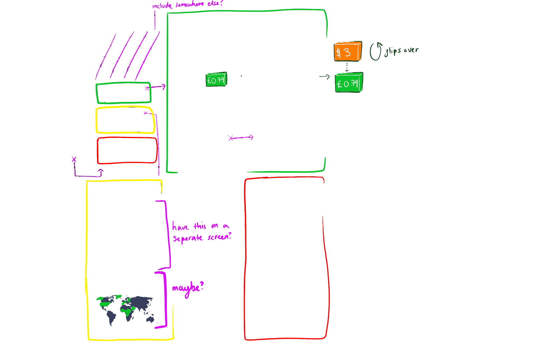
mid fidelity


a/b Testing
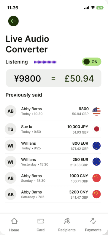
Through A/B testing and user feedback, the first iteration highlighted issues with visual hierarchy and context.

Leading us to refine the design into a clearer, more intuitive solution with the separate timeframes in one section.
prototypes
full project